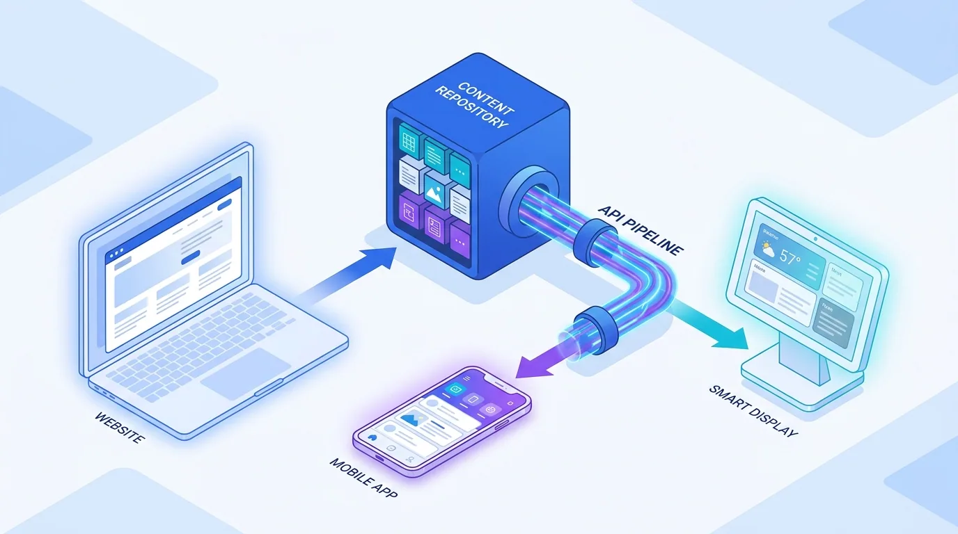
Mobile-first design means designing your website for the smartphone screen first, then progressively enhancing it for larger devices — and in 2026 it still wins because the majority of your visitors, your search rankings, and your conversions now happen on a phone. Google indexes the mobile version of your site, your customers research and buy on mobile, and a page that is awkward on a small screen loses on every front at once.
Mobile-first is sometimes dismissed as old advice, but it has only become more important. The difference in 2026 is that the bar is higher: faster load times, larger touch targets, and AI-driven search that rewards clean, fast, mobile-friendly pages. This guide explains why it still wins and how to get it right.
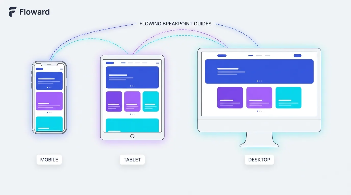
What is mobile-first design, exactly?
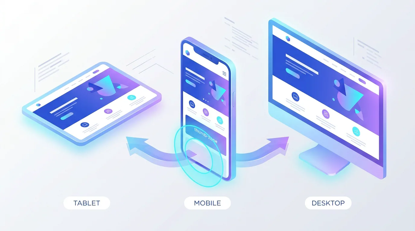
Mobile-first design is a strategy where you build the smallest, most constrained experience first — the phone — and then add complexity for tablets and desktops. It is the opposite of the old approach of designing a rich desktop site and then squeezing it down to fit a phone, which almost always produces a compromised mobile experience.
Starting from the constraint forces discipline. When you only have a narrow screen and a thumb to work with, you are pushed to prioritise the content that matters, simplify navigation, and cut anything non-essential. That clarity then carries up to the larger layouts, making the whole site better — not just the mobile version.
Why does mobile-first design still win in 2026?
Mobile-first wins because Google uses mobile-first indexing, most users are on phones, and the constraints of mobile produce a faster, clearer site that performs better everywhere. When you design for the hardest case first, you tend to ship a better product overall.

There is also an AI-search dimension. Answer engines and AI Overviews favour pages that are fast and easy to render, and mobile-first sites tend to be lean by design. A bloated desktop-first site that is slow on a phone is exactly the kind of page that gets passed over in favour of a cleaner competitor — both by users and by the AI deciding which sources to cite.
The user behaviour reinforces all of this. People reach for their phone in fragmented moments — on a commute, in a queue, on the sofa with the television on — and they bring almost no patience to a site that fights them. A layout that requires pinching, a button too small to hit, or a three-second blank screen is enough to send them straight back to the search results. Mobile-first design treats that low-patience, one-thumb context as the default reality rather than an edge case, and that single shift in assumption is why it consistently produces stronger results.
What does great mobile UX look like?
Great mobile UX respects two realities: the screen is small and the user is operating it with a thumb, often distracted and in a hurry. Everything important should be reachable, tappable, and legible without zooming, and the most common actions should sit within easy reach of the thumb.
- Large touch targets: buttons and links at least around 44px so they are easy to tap accurately.
- Thumb-friendly placement: put primary actions in the lower and central zones where thumbs naturally rest.
- Readable text: body copy around 16px or larger so nobody has to pinch-zoom.
- Simplified navigation: a clear menu and minimal steps to the things people actually want.
- Generous spacing: room between tappable elements to prevent accidental taps.
On a phone, every extra tap, every tiny button, and every slow second is a reason to leave. Mobile-first design is really just respect for a user who has no patience to spare.
— Aiden Brooks, Lead Web Engineer, Fryntavo
How does mobile-first affect performance?
Mobile devices are often on slower networks and less powerful chips than desktops, so performance is where mobile-first design pays off most. Designing lean from the start — fewer heavy assets, optimised images, and minimal JavaScript — keeps the experience fast on the devices and connections that matter most.
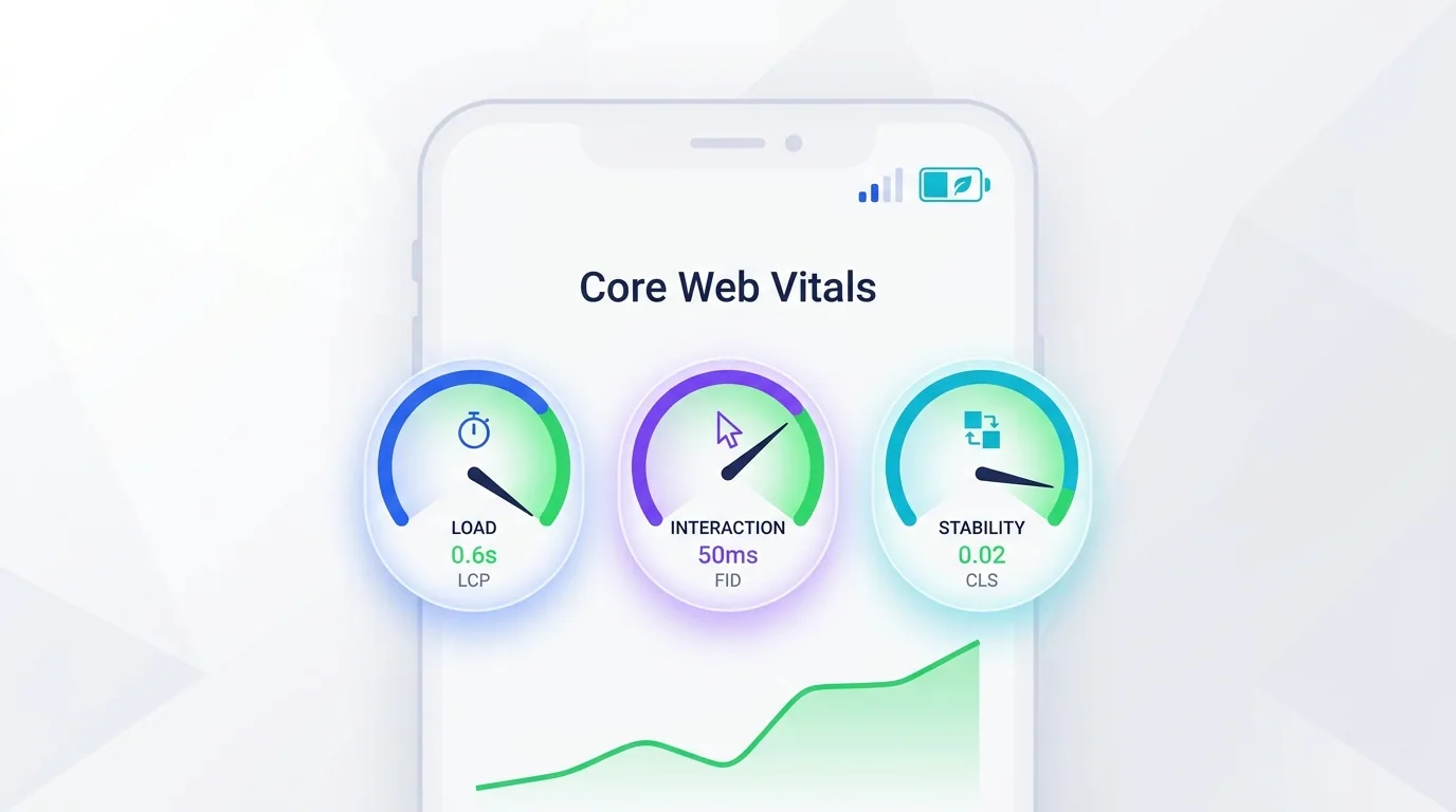
The 2026 Core Web Vitals thresholds — an LCP near 2.0 seconds, an INP under 200ms, and CLS under 0.1 — are evaluated against real-world mobile conditions. A mobile-first build that loads quickly and responds instantly to taps is far better positioned to hit those targets, which is why we treat performance as a core part of every web development project rather than an afterthought.
How does mobile-first improve conversion?
Mobile conversion has historically lagged desktop, and the reason is usually friction: tiny forms, fiddly buttons, slow loads, and checkout flows that feel built for a mouse. A mobile-first approach attacks that friction directly, and the result is more visitors completing the action you care about.
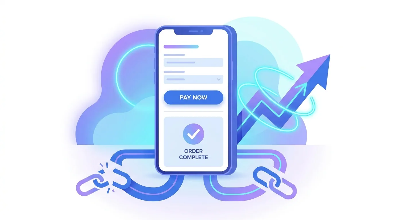
Keep mobile forms short, use the right input types so the correct keyboard appears, enable autofill and digital wallets, and make the primary button large and obvious. Every field you remove and every tap you save lifts mobile conversion, because on a phone, convenience and speed are the entire battle.
Sticky calls to action are a quiet mobile-conversion winner too. On a small screen the visitor cannot see the whole page at once, so a persistent button pinned to the bottom of the viewport — 'Book now', 'Add to cart', 'Get a quote' — keeps the next step one thumb-tap away no matter how far they have scrolled. Pair that with fast-loading product imagery and clear pricing, and you remove most of the reasons mobile shoppers abandon before completing.
What is the difference between mobile-first and responsive design?
They are related but not the same. Responsive design is the technical ability of a layout to adapt to any screen size. Mobile-first is a design philosophy about the order in which you design — starting from the smallest screen and scaling up. The strongest sites use both: a mobile-first mindset implemented with responsive techniques.
In practice, that means building one responsive codebase, designing the mobile layout first to force prioritisation, and then enhancing — adding columns, larger imagery, and richer interactions — as the screen grows. You never end up with a desktop site awkwardly crammed onto a phone, because the phone was the starting point.
Mobile-first design is not a trend that came and went; it is the baseline reality of how people use the web in 2026. Design for the phone first, keep it fast, make it effortless to tap and read, and let the larger screens be the enhancement rather than the priority. Do that, and you win on rankings, UX, and conversion at the same time.
Is your site genuinely fast and effortless on a phone? Our team builds mobile-first, responsive sites that rank well and convert visitors wherever they are.
Get a Mobile-First BuildFrequently asked questions
What is mobile-first design?
Mobile-first design is an approach where you design and build the smartphone experience first, then progressively enhance the layout for tablets and desktops. It is the opposite of designing a desktop site and shrinking it down, and it tends to produce faster, clearer sites because it forces you to prioritise from the start.
Is mobile-first design still relevant in 2026?
Yes, more than ever. Most web traffic comes from phones, Google uses mobile-first indexing to rank sites, and AI-driven search rewards fast, clean, mobile-friendly pages. Designing for mobile first remains the most reliable way to win on rankings, user experience, and conversion simultaneously.
What is the difference between mobile-first and responsive design?
Responsive design is the technical ability of a layout to adapt to any screen size, while mobile-first is a design philosophy about starting from the smallest screen and scaling up. The best sites combine both: a mobile-first mindset implemented with responsive techniques in a single codebase.
Does mobile-first design affect SEO?
Significantly. Google primarily uses the mobile version of your site for indexing and ranking, so a thin or slow mobile experience caps your visibility no matter how good the desktop version is. Mobile-first builds also tend to be faster, which helps Core Web Vitals and AI-search eligibility.
How big should touch targets be on mobile?
Aim for a minimum of around 44px for buttons and tappable links, with generous spacing between them to prevent accidental taps. Comfortable, thumb-friendly touch targets reduce frustration and errors, which directly improves the mobile experience and conversion rate.
Why is mobile conversion often lower than desktop?
It is usually a friction problem rather than an intent problem: small forms, fiddly buttons, slow load times, and checkout flows built for a mouse. A mobile-first approach with short forms, the right input types, autofill, digital wallets, and large buttons removes that friction and lifts conversions.
How do I make my website faster on mobile?
Design lean from the start, optimise images into modern formats like WebP and AVIF, minimise JavaScript, and avoid layout shift. Target the 2026 Core Web Vitals of an LCP near 2.0 seconds, an INP under 200ms, and CLS under 0.1, and test on real mid-range phones over normal mobile networks.
Can Fryntavo build a mobile-first website for me?
Yes. Fryntavo builds mobile-first, responsive websites on fast modern foundations, designed to rank well, load quickly, and convert visitors on any device. Book a consultation and we will create a site that performs everywhere your customers are.
Ready to put this into action?
Fryntavo helps brands grow with web development, SEO, marketplace management, and AI automation. Book a free, no-obligation strategy call.
Book a Free Strategy Call