A high-converting landing page in 2026 does three things exceptionally well: it communicates one clear value proposition in seconds, it removes every distraction except the single action you want the visitor to take, and it loads fast enough that nobody bounces before the page even renders. Everything else — colours, copy length, imagery — is detail in service of those three principles.
Most pages underperform not because of a bad button colour, but because they ask the visitor to do too many things, bury the offer, or load slowly on mobile. This guide breaks down the landing page best practices that consistently lift conversion rates, and the structure we use when we build pages designed to turn clicks into customers.
What makes a landing page convert?
A landing page converts when the visitor instantly understands what you offer, why it matters to them, and exactly what to do next — with no friction in between. The page has a single goal, a single primary action, and enough proof to make saying yes feel safe.
The fastest way to kill conversions is to treat a landing page like a homepage. A homepage serves many audiences and many goals; a landing page serves one audience with one goal. The discipline of subtraction — cutting navigation, secondary offers, and competing links — is what separates a page that converts from a page that merely informs.
Why is the headline and above-the-fold so important?
Visitors decide whether to stay within seconds, and that decision is made almost entirely on what they see first. Your headline must state the core benefit in plain language — what the visitor gets, not what your product technically is. The subheadline adds the supporting detail, and a hero visual reinforces the promise.
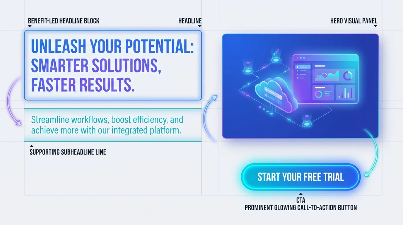
Lead with the outcome, not the feature. "Get more qualified leads in 30 days" beats "AI-powered lead generation platform" because it speaks to what the visitor actually wants. The above-the-fold area should answer two questions before the visitor scrolls: what is this, and why should I care?
Match the message to the source. If a visitor clicked an ad or a search result promising a specific thing, the headline they land on should echo that exact promise — a phenomenon called message match. When the page mirrors the expectation that brought someone there, conversions rise sharply because the visitor immediately feels they are in the right place rather than wondering whether they clicked the wrong link.
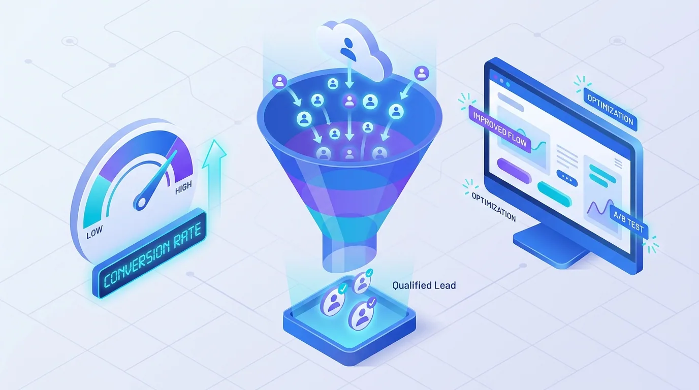
How many calls to action should a landing page have?
One primary call to action, repeated. Every high-converting landing page is built around a single action — book a call, start a trial, request a quote — and that one CTA appears multiple times as the visitor scrolls, so they can act the moment they are convinced. Competing CTAs split attention and lower conversions.
Make the button copy specific and benefit-driven. "Get my free audit" outperforms "Submit" because it describes the value, not the mechanic. Use a colour that contrasts strongly with the rest of the page so the action is impossible to miss, and keep the surrounding space clean so nothing competes with it.
- One primary action per page — remove secondary offers and outbound links.
- Repeat the CTA after each major section so the visitor can act when ready.
- Use benefit-led button copy like 'Start my free trial', not 'Submit'.
- High-contrast button that stands out from everything around it.
- Reduce form friction — ask only for the fields you genuinely need.
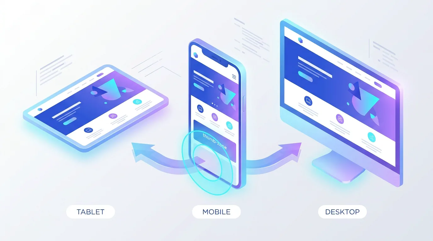
How does page speed affect conversion?
Speed is conversion. A slow landing page loses visitors before they read a word, and the effect is brutal on mobile where most traffic now lands. In 2026, with Core Web Vitals targets of an LCP near 2.0 seconds, an INP under 200ms, and CLS under 0.1, a fast page is both a ranking advantage and a conversion advantage.
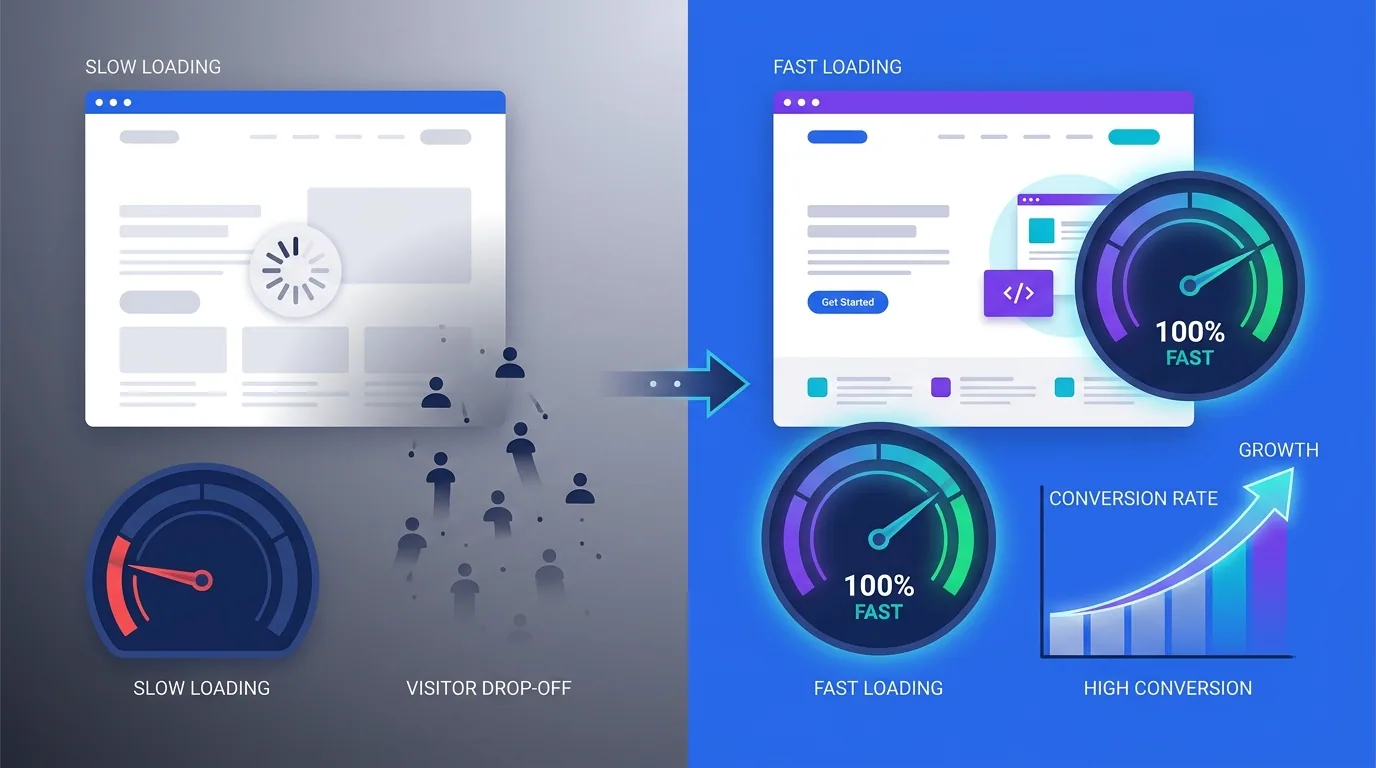
Optimise images into modern formats, defer non-critical scripts, and avoid layout shift that makes buttons jump as the page loads. We build landing pages on fast web foundations precisely because every fraction of a second of delay quietly erodes the conversion rate you worked to earn.
What role does social proof and trust play?
People convert when they feel safe, and proof is what makes them feel safe. Testimonials, client logos, review counts, case-study results, and trust badges all reduce the perceived risk of saying yes. Place proof near the points of friction — right beside the form or CTA — where doubt is highest.
Visitors do not buy because your page is clever. They buy because the offer is clear, the proof is credible, and the next step is obvious. Clarity and trust beat cleverness every time.
— Aiden Brooks, Lead Web Engineer, Fryntavo
Specific proof beats generic praise. "Increased our qualified leads by 180% in three months" is far more persuasive than "Great service!" because it is concrete and believable. Where you can, pair a result with a name, role, and photo to make it real.
Objections are the other half of trust. Every visitor arrives with quiet doubts — is it too expensive, will it actually work, what if it is not right for me — and a high-converting page answers those doubts before they harden into a reason to leave. A short FAQ, a clear guarantee, a transparent pricing note, or a risk-reversal line like 'cancel anytime' can lift conversions more than any visual change, because they remove the specific fear holding the visitor back.
How should you structure the page from top to bottom?
A reliable landing page structure guides the visitor from attention to action in a logical order: hook them, build desire, prove the claim, handle objections, and make the action easy. Each section should advance the visitor one step closer to converting, with the CTA always within reach.
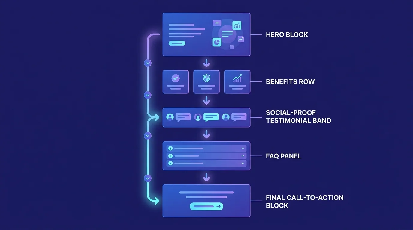
- Hero: benefit-led headline, subheadline, hero visual, and primary CTA.
- Benefits: how the offer improves the visitor's life, framed as outcomes.
- Social proof: testimonials, results, logos, and review counts.
- Objection handling: an FAQ or guarantee section that removes hesitation.
- Final CTA: a strong, low-friction close that repeats the primary action.
How do you keep improving conversion over time?
A landing page is never finished — it is a hypothesis you keep testing. Track your conversion rate, watch where visitors drop off with heatmaps and scroll data, and run A/B tests on the elements that matter most: the headline, the offer, the CTA, and the form length. Small, evidence-based changes compound into large gains.
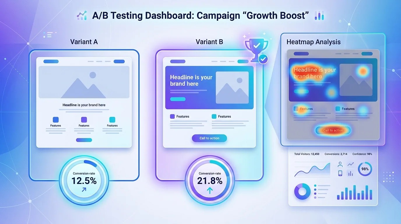
Prioritise tests by potential impact: the headline and the offer move the needle far more than a button colour. And remember that traffic quality matters too — the best page in the world converts poorly if it is fed unqualified visitors, which is why landing pages work best paired with a focused SEO and traffic strategy.
Build for clarity, speed, trust, and a single obvious action, then refine with data. That is the entire game. A landing page that respects the visitor's time and attention will reliably outconvert a flashier page that does not.
Want a landing page that turns your traffic into leads and sales? Our team designs, builds, and optimises pages engineered to convert.
Build a High-Converting PageFrequently asked questions
What makes a landing page high-converting?
A high-converting landing page communicates one clear value proposition fast, focuses on a single primary action with the navigation and distractions removed, loads quickly, and includes credible social proof near the points of friction. Clarity, focus, speed, and trust are the core drivers.
How many calls to action should a landing page have?
One primary call to action, repeated as the visitor scrolls. A single, consistent action lets visitors convert the moment they are convinced, whereas multiple competing CTAs split attention and lower conversions. Repeat the same CTA after each major section rather than introducing new ones.
What is a good landing page conversion rate?
It varies by industry and traffic source, but many focused B2B and service landing pages convert in the mid single digits to low double digits, while strong offers can do better. Rather than chasing a benchmark, measure your own baseline and improve it with structured testing of the headline, offer, and CTA.
Why is page speed important for landing pages?
Slow pages lose visitors before they engage, especially on mobile. In 2026, Core Web Vitals targets of an LCP near 2.0 seconds, an INP under 200ms, and CLS under 0.1 make a fast page both a ranking and a conversion advantage. Every second of delay quietly reduces your conversion rate.
Should a landing page have navigation?
Usually not. Removing the main navigation and outbound links keeps the visitor focused on the single primary action. A homepage serves many goals, but a dedicated landing page should serve one, so anything that lets the visitor wander away tends to lower conversions.
How long should a landing page be?
As long as it needs to be to make the case and no longer. Simple, low-risk offers can convert with short pages, while higher-priced or complex offers often need more proof, benefits, and objection handling. Let the complexity of the decision determine the length, not an arbitrary rule.
How do I improve my landing page conversion rate?
Clarify the headline and offer, reduce to a single primary CTA, cut form fields to the essentials, add specific social proof near the action, and ensure the page loads fast. Then run A/B tests on the highest-impact elements and use heatmaps to find and fix drop-off points.
Can Fryntavo design a high-converting landing page for me?
Yes. Fryntavo designs, builds, and optimises landing pages on fast modern foundations, with conversion-focused structure, copy, and testing. Book a consultation and we will create a page engineered to turn your traffic into leads and sales.
Ready to put this into action?
Fryntavo helps brands grow with web development, SEO, marketplace management, and AI automation. Book a free, no-obligation strategy call.
Book a Free Strategy Call