The biggest graphic design trends 2026 are not surface-level aesthetics — they are responses to how people now discover and trust brands. The headline shifts are AI-assisted brand systems, motion-first identities that flex across screens, expressive maximalist typography, tactile and hand-made texture, and accessibility-led color. Together they reward brands that feel human, move fluidly, and stay unmistakably consistent everywhere.
As a creative director, I judge a trend by one question: does it make a brand more memorable and more useful, or just more decorated? This guide walks through the design trends 2026 that pass that test, with practical notes on how our graphic design team is applying each one for real clients this year.
What are the biggest graphic design trends in 2026?
In 2026, design has moved from static logos to living systems. A brand is no longer one mark and one palette — it is a flexible kit of motion, type, color, and texture that adapts to a feed, a storefront, an app, and an AI-generated answer card. The brands that win look intentional in every one of those contexts.
Below are the six visual trends 2026 shaping the work we are most proud of. None of them are gimmicks; each one earns its place by improving recognition, clarity, or emotional pull.
Why are brands moving to motion-first identities?
Static logos were designed for letterheads. In 2026, your identity lives in vertical video, reels, app launch screens, and animated ad units — so the smartest brands now design the motion before the still. A logo that breathes, morphs, and reacts is more memorable than one that just sits there.
Motion-first does not mean chaos. The best systems define a small set of signature movements — a confident reveal, a soft loop, a transition gesture — and reuse them everywhere. That repetition is what turns animation into recognition.

We treat the motion spec as a core deliverable, not an afterthought. Easing curves, durations, and entrance behaviors go into the brand guidelines alongside color and type, so every future asset moves in the same recognizable voice.
There is also a practical payoff: a defined motion library makes production faster and cheaper. Once your editors and designers have approved transitions and reveals on file, they stop reinventing the wheel for every reel and ad, and the brand looks tighter across hundreds of assets without extra effort.
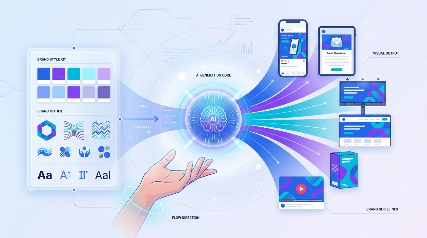
How is AI changing graphic design in 2026?
AI has not replaced designers — it has changed where designers spend their hours. The repetitive work of resizing, background removal, variant generation, and first-draft exploration is now near-instant. That frees creative teams to focus on the parts AI cannot do well: strategy, taste, narrative, and brand-specific judgment.
The trend that matters here is AI-assisted brand systems — design kits built so that AI tools can generate on-brand variations safely. When your palette, type rules, and visual motifs are codified clearly, you can spin up dozens of consistent assets in minutes instead of days. Pairing strong human direction with generative tools is also how our AI-driven creative work scales content without losing a brand's soul.
Is bold typography still a trend in 2026?
More than ever. After years of safe, near-identical geometric sans-serifs, 2026 is leaning into expressive, oversized, characterful type. Variable fonts let a single typeface stretch from delicate to dramatic, and brands are using type itself as the hero image rather than decoration around a photo.
- Variable fonts that shift weight and width responsively across breakpoints and animations.
- Oversized headlines that fill the frame and double as the primary visual element.
- Mixed type systems pairing a quirky display face with a calm, legible body face.
- Kinetic type where words animate to reinforce meaning, especially in short-form video.

What about color and texture trends for 2026?
Two forces are pulling color in opposite, complementary directions. On one side, accessibility-led palettes with strong contrast ratios are now a baseline, not a bonus — brands are designing for legibility and inclusion from the first swatch. On the other, rich gradient meshes and dimensional color add depth and emotion where flat design once dominated.
Texture is the other big move. After a long run of clean, frictionless flat design, 2026 embraces tactile maximalism: grain, paper, hand-drawn marks, collage, and subtle 3D materials. It reads as human and crafted — a deliberate antidote to a feed full of slick, AI-generic visuals.
The reason this matters now is differentiation. When anyone can generate a polished gradient in seconds, polish stops being a competitive edge. Imperfection, warmth, and evidence of a human hand signal effort and personality — and audiences increasingly reward brands that feel made by people rather than churned out by a template.
The brands that feel most alive in 2026 are the ones brave enough to look a little handmade in a sea of machine-perfect sameness.
— Lena Vasquez, Creative Director, Fryntavo
How do you apply these trends without breaking your brand?
Trends are ingredients, not the recipe. The mistake I see most is bolting a trendy effect onto an identity that has no strategy underneath, which ages badly within months. The fix is to anchor every trend to your brand's core promise and audience, then adopt only what reinforces it.
- Start with strategy: who you serve, what you promise, and the feeling you want to leave behind.
- Audit your current assets for consistency gaps before chasing anything new.
- Pilot one trend at a time on a real campaign and measure recall and engagement.
- Codify what works into your brand guidelines so it scales without you in the room.
- Revisit the system quarterly — living identities should evolve, not ossify.

Consistency is the multiplier. A modest brand applied flawlessly everywhere beats a brilliant one applied unevenly. That is why we package every identity as a documented system — colors, type, motion, texture, and usage rules — so the brand looks deliberate whether it shows up in a story, a checkout page, or a printed pack.
What design trends should you ignore in 2026?
Not every trend deserves your budget. Avoid effects that fight legibility, lean on novelty alone, or copy a competitor so closely that you blur your distinctiveness. If a trend cannot survive being applied across fifty real touchpoints, it is a one-off art piece, not a brand decision.

The throughline across every one of these branding trends 2026 is intentionality. Motion, AI, bold type, accessible color, and tactile texture are powerful — but only when they ladder up to a clear strategy and a system that holds together. Get that foundation right and trends become tools, not traps.
Want a 2026-ready brand system that turns these trends into real recognition and growth? Our creative team can audit your identity and build a kit that works everywhere.
Start a Design ProjectFrequently asked questions
What are the top graphic design trends in 2026?
The leading graphic design trends 2026 are AI-assisted brand systems, motion-first identities, expressive bold typography, tactile maximalist texture, dimensional gradient color, and accessibility-led palettes. Each focuses on making brands more memorable and consistent across screens rather than just decorative.
Is flat design dead in 2026?
Not dead, but evolving. Pure minimal flat design is giving way to tactile maximalism that adds grain, texture, and dimensional color for a more human, crafted feel. Many brands now blend clean layouts with richer surfaces to stand out from machine-generic visuals.
How is AI affecting graphic design trends in 2026?
AI handles repetitive production tasks like resizing, background removal, and first-draft variations, freeing designers to focus on strategy and taste. The key trend is AI-assisted brand systems: codifying palettes, type, and motifs so generative tools can produce on-brand assets at scale.
Why is motion design so important for branding in 2026?
Most brand impressions now happen in video, apps, and animated ads, so identities need to move. Motion-first branding defines signature animations once and reuses them everywhere, turning movement into a recognizable part of the brand the way a logo or color is.
Is bold typography still trending in 2026?
Yes. Expressive, oversized, variable typography is a defining trend, with type often acting as the hero visual rather than supporting a photo. Variable fonts let one typeface flex across weights and widths for responsive, animated layouts.
How do I follow design trends without making my brand look dated quickly?
Anchor every trend to your brand strategy and audience, pilot one at a time on real campaigns, and only codify what improves recall or engagement. Trends applied on top of a solid system age gracefully; trends applied for novelty alone do not.
What color trends should brands use in 2026?
Accessibility-led, high-contrast palettes are now the baseline for inclusive, legible design. Alongside that, dimensional gradient meshes add depth and emotion. The best 2026 palettes balance strong contrast with richer, more expressive color.
Can Fryntavo help apply these design trends to my brand?
Yes. Fryntavo's creative team builds documented brand systems covering color, typography, motion, and texture so trends translate into consistent recognition across every channel. Book a call to audit your identity and plan a 2026 refresh.
Ready to put this into action?
Fryntavo helps brands grow with web development, SEO, marketplace management, and AI automation. Book a free, no-obligation strategy call.
Book a Free Strategy Call